In an attempt to consolidate blog, website, flickr, Facebook, Twitter, Etsy etc etc I'll now be posting my regular doodles and photos on Instagram and Facebook.
Thanks very much for all the comments and for looking in here - I hope you'll continue over at the new places!
Friday, November 07, 2014
Monday, March 03, 2014
1916 Short S184
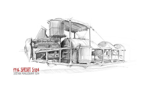
This interesting exhibit is in the Fleet Air Arm Museum. It survived service in WW1 and was then given to the Imperial War Museum - where it was damaged in WWII! Unfortunately it's in a glass case and surrounded by lots of lights which makes it rather hard to sketch.
1949 Westland Dragonfly
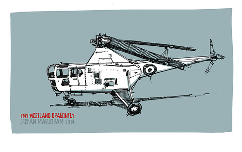
I love the shapes of some of the machines in the Fleet Air Arm Museum - some of the best are the early helicopters. This was a quick-ish Sharpie marker sketch (colour added in Photoshop later)
Skinning BLOODHOUND SSC's upper chassis
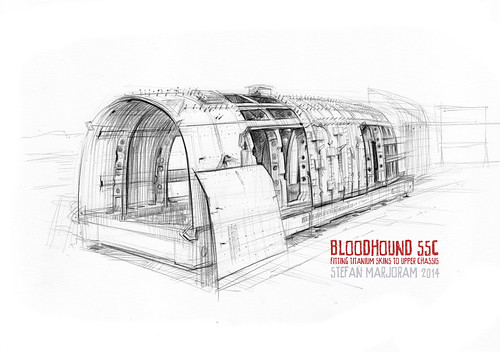
Found a bit of time to sketch the fantastic work that's been done on BLOODHOUND SSC's upper chassis recently. This part will house the EJ200 jet (from a Typhoon). It's constructed with aluminium ribs and titanium stringers. The shaped titanium skins are now being drilled ready for gluing and riveting.
Monday, February 10, 2014
BLOODHOUND SSC Land Speed Record car construction

Here's a sketch of the Bloodhound lower chassis and monocoque being aligned on the surface plate. I did it ages ago but forgot to upload it. Time to do another I think.
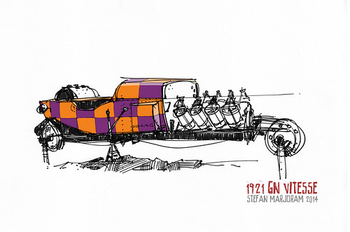
1907 Minerva V-twin
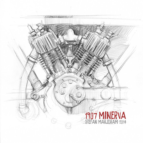
A very early motorbike. Single speed with a belt drive to the rear wheel, there is no clutch or gearbox! You pedal to get started and cut the ignition to stop! Minerva supplied engines to Triumph in it's early days.
Friday, January 31, 2014
Dr Sketchy's Life Drawing, Bristol
Just discovered Bristol finally has Dr Sketchy's Life Drawing events. It's a great mix of burlesque entertainment and drawing - usually in a bar so there's beer too. I first heard about these a few years back and thought they sounded a lot of fun - now I know they are. My first time life drawing in 2 years or so - I was pretty rusty but I like the last sketch. Looking forward to the next one.
First up was the Diva...
 The next model was Dis Charge - strikingly tall and with great make up. We were treated to a song part way through too!
 The final model of the session was Daphne Dangerpants. She had a great costume which I'd love to have had more time to sketch.
 Daphne minus the costume…
 Really pleased with this last drawing - I like the lost edges on the arm in the shade and the tattoo.

First up was the Diva...
Friday, January 17, 2014
piggies
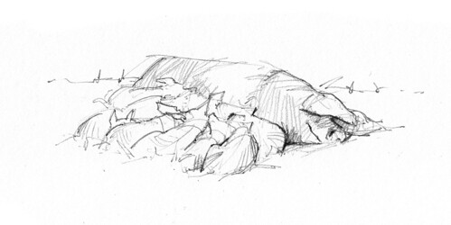
Had a brief walk around Puxton Park yesterday. Biting cold wind. Didn't seem to bother this happy family though...
Soft Black Pencils - the search for a Prismacolor alternative
If you've watched any drawing tutorials or car design sketchers on youtube you'll probably have heard about black Prismacolor pencils. I tried some a year or so ago and was delighted with the smooth waxyness, the lack of sheen, and the rich tones I could get with them - but here in the UK they weren't easy to find. You need to resort to mail order from places like http://www.1buy1pencils.co.uk. Sometimes these suppliers run out of stock and I've read that the pencil quality dropped off a bit after they moved to a different manufacturer. So what options are there for UK sketchers who like soft black pencils? Are there any others as good as the Prismacolor? I ordered a selection (mostly from http://www.pencils4artists.co.uk) and tried to find out…

PRISMACOLOR 935 - not too hard, not too soft, not too waxy, not too dry. Smudgeproof. Just about perfect!
CARAN d'ACHE Luminance 6901 - a tiny bit less waxy than the Prismacolor but gives an almost identical range of tones.
CRETACOLOR Nero Soft - Much drier - more like a graphite pencil but still gives deep blacks with little pressure. Hardness will probably mean it keeps its point well. It's a slightly warm black and does smudge a little.
FABER CASTELL Pitt Oil Base Soft - A little less waxy and a tiny bit lighter but very close to the Prismacolor.
LYRA Rembrandt Polycolor - Slightly slimmer than the others which - I find very comfortable. A little less waxy than the Prismacolor and it doesn't give such rich blacks.
DERWENT Coloursoft C650 - Less waxy than the Prismacolor but still gives a good range of tones. Again a slightly warm brownish black.
LYRA Color Giant 3940099 & Super Ferby - Chunky pencils. Too hard and slightly brown. It's a shame that companies mess around with the formulas. I have a stub of the old 9305 Color Giant which is every bit as good as the Prismacolor - perhaps even better - with rich, pure blacks and great softness. Ho hum.
STABILO Trio - Chunky and triangular. Available from Staples office supplies. Very similar range and feel to Prismacolor but ever so slightly warmer.
And a couple of others that are a bit more extreme than the Prismacolor…
STAEDTLER Lumocolor - Permanent and waterproof. It's incredibly soft and waxy - almost like a wax crayon or Chinagraph but lovely and smooth. Could be great for large gestural sketches or even sketching in the rain! Be prepared for lots of sharpening though. Bit of sheen and does smudge a little.
CONTÉ Pierre Noire 2B - a sort of Conté crayon in pencil form. Dry like charcoal rather than waxy. Lovely sooty blacks, completely matt. As you'd expect, it does smudge.

CONCLUSION: If you find yourself out in the wilds without a Prismacolor and there's an art store nearby you might find the Caran d'Ache or Faber Castell makes an excellent replacement. The Cretacolor, Derwent and Stabilo are very close seconds and all very nice to draw with.
Although the Staedtler Lumocolor and Conté don't fit into the wax pencil category they are still definitely worth a look as they make some lovely marks.

Lastly, I ought to mention my new KUM automatic long point sharpener. It's a two-stage sharpener which sharpens first the wood, then the lead, and it's done a grand job of sharpening all of the above pencils (except the chunky ones) - even the very soft and brittle ones which my old sharpener used to snap the leads in. It might be down to new blades but I think sharpening the wood first is a good idea as you can then go very delicately when you come to the lead itself. My model also has a couple of small holes in the sides for sharpening clutch pencil leads (2mm and 3mm I think)
Hope that helps! Let me know your thoughts.
PRISMACOLOR 935 - not too hard, not too soft, not too waxy, not too dry. Smudgeproof. Just about perfect!
CARAN d'ACHE Luminance 6901 - a tiny bit less waxy than the Prismacolor but gives an almost identical range of tones.
CRETACOLOR Nero Soft - Much drier - more like a graphite pencil but still gives deep blacks with little pressure. Hardness will probably mean it keeps its point well. It's a slightly warm black and does smudge a little.
FABER CASTELL Pitt Oil Base Soft - A little less waxy and a tiny bit lighter but very close to the Prismacolor.
LYRA Rembrandt Polycolor - Slightly slimmer than the others which - I find very comfortable. A little less waxy than the Prismacolor and it doesn't give such rich blacks.
DERWENT Coloursoft C650 - Less waxy than the Prismacolor but still gives a good range of tones. Again a slightly warm brownish black.
LYRA Color Giant 3940099 & Super Ferby - Chunky pencils. Too hard and slightly brown. It's a shame that companies mess around with the formulas. I have a stub of the old 9305 Color Giant which is every bit as good as the Prismacolor - perhaps even better - with rich, pure blacks and great softness. Ho hum.
STABILO Trio - Chunky and triangular. Available from Staples office supplies. Very similar range and feel to Prismacolor but ever so slightly warmer.
And a couple of others that are a bit more extreme than the Prismacolor…
STAEDTLER Lumocolor - Permanent and waterproof. It's incredibly soft and waxy - almost like a wax crayon or Chinagraph but lovely and smooth. Could be great for large gestural sketches or even sketching in the rain! Be prepared for lots of sharpening though. Bit of sheen and does smudge a little.
CONTÉ Pierre Noire 2B - a sort of Conté crayon in pencil form. Dry like charcoal rather than waxy. Lovely sooty blacks, completely matt. As you'd expect, it does smudge.
CONCLUSION: If you find yourself out in the wilds without a Prismacolor and there's an art store nearby you might find the Caran d'Ache or Faber Castell makes an excellent replacement. The Cretacolor, Derwent and Stabilo are very close seconds and all very nice to draw with.
Although the Staedtler Lumocolor and Conté don't fit into the wax pencil category they are still definitely worth a look as they make some lovely marks.
Lastly, I ought to mention my new KUM automatic long point sharpener. It's a two-stage sharpener which sharpens first the wood, then the lead, and it's done a grand job of sharpening all of the above pencils (except the chunky ones) - even the very soft and brittle ones which my old sharpener used to snap the leads in. It might be down to new blades but I think sharpening the wood first is a good idea as you can then go very delicately when you come to the lead itself. My model also has a couple of small holes in the sides for sharpening clutch pencil leads (2mm and 3mm I think)
Hope that helps! Let me know your thoughts.
Sunday, January 12, 2014
The Search for the Ultimate Drawing Pencil!
Life would be so easy if I just knew which pencil to draw with. But on the other hand I do rather enjoy browsing the shelves of stationery shops, taking a punt on a pen or pencil that I haven't used before, wondering if it will be 'the one'. I've amassed quite a few drawing implements by now - and it's made packing my bag harder. So here's an attempt to make sense of my pen pots and put them into some sort of order.

The pencils fall into three categories…
Graphite - Your standard pencil. Glide well, easy to erase but quite shiny on the paper (which doesn't always scan well).
Wax - Like colouring pencils. Smooth to draw with, they're quite smudge-resistant (but harder to erase)
Charcoal - Much drier, occasionally even scratchy but making rich, sooty blacks, without any sheen.
GRAPHITE
CONTÉ 601- always a shade darker than STAEDTLER (a 2B is more like a 3B). I have an old hexagonal 3B that was quite the best pencil I've ever used. Smooth as anything and easy to hold and sharpen. It seems to have been replaced with round pencils which are drier and don't sharpen so well. The FABER CASTELLs and STAEDTLERs are better.
FABER CASTELL 9000 - always shade lighter than STAEDTLER (a 2B is more like a B). Nice to use, sharpen well - and look very posh with their Harrod's colour scheme.
STAEDTLER Tradition and Mars - There's very little between them - but I probably favour the Tradition slightly.
DERWENT (not pictured) - perhaps I got a bad batch but I kept getting those hideous scratchy impurities in them and haven't touched them since.
Verdict: Who'd have thought it. The cheap and cheerful STAEDTLER Tradition, available in every corner shop is as good a pencil as you're likely to find anywhere. The FABER CASTELLs are nice too but I'd give the round CONTÉ's a miss (which is a shame because the old type would have been the winner).
WAX - (FROM LIGHT TO DARK)
PRISMACOLOR Col-erase - the black version of the famous blue pencil used by animators the world over. It was a bit harder than I was expecting. Still, nice and waxy and good for making light marks.
BEROL Verithin - similar to use but a little darker than the Col-erase.
STAEDTLER Ergosoft - a useful shade, giving a good range. Triangular and comfortable to hold. It has a rubbery finish.
LYRA Super Ferby - nice wood finish but perhaps a bit too large to be really comfortable. Very slight brown tint.
STABILO Trio - Chunky but comfortable. Nice to use, soft - but again a very slight brownish tint.
PRISMACOLOR 935 - Lovely. Smooth, great range of shades. Brittle - I have to sharpen mine with a knife.
LYRA Color-Giant 9305 - A chunky wooden pencil as soft and good to use as the Prismacolor - and better to sharpen too! If only I could find more.
Verdict: PRISMACOLOR 935 and LYRA Color Giant are both fantastic - and both the hardest to get hold of here in the UK
CHARCOAL
CONTÉ 1710 2B - Beautiful to use - quite waxy for a charcoal type pencil. Very brittle - need to use a knife to sharpen.
WOLFF'S CARBON 2B - much drier than the Conté - no where near as nice to use.
STAEDTLER Mars 7B & 8B - these fall between the graphite and charcoal pencils. They hardly have a sheen but they're not as dark as the Conté. They sharpen well and are smooth to draw with - although slightly drier than typical graphite pencils.
Verdict: I really haven't made much use of the charcoal pencils so far as the dryness put me off. However the CONTÉ is rather special so I'm going to sketch something with it next time out.

To sum up, I like my pencils to be smooth. My favourite combination for loose sketching at A4 and larger is probably the Prismacolor 935 on Bristol paper. Smooth as anything, you can get a whole range of shades with very little smudging. I'd be equally happy with the LYRA Color-Giants. For smaller, tighter drawing I resort to a graphite pencil - and it'll be the trusty Staedtler Traditions from now on. (Unless I can find a cache of those hexagonal Contés somewhere).
Let me know your experiences and thoughts!
The pencils fall into three categories…
Graphite - Your standard pencil. Glide well, easy to erase but quite shiny on the paper (which doesn't always scan well).
Wax - Like colouring pencils. Smooth to draw with, they're quite smudge-resistant (but harder to erase)
Charcoal - Much drier, occasionally even scratchy but making rich, sooty blacks, without any sheen.
GRAPHITE
CONTÉ 601- always a shade darker than STAEDTLER (a 2B is more like a 3B). I have an old hexagonal 3B that was quite the best pencil I've ever used. Smooth as anything and easy to hold and sharpen. It seems to have been replaced with round pencils which are drier and don't sharpen so well. The FABER CASTELLs and STAEDTLERs are better.
FABER CASTELL 9000 - always shade lighter than STAEDTLER (a 2B is more like a B). Nice to use, sharpen well - and look very posh with their Harrod's colour scheme.
STAEDTLER Tradition and Mars - There's very little between them - but I probably favour the Tradition slightly.
DERWENT (not pictured) - perhaps I got a bad batch but I kept getting those hideous scratchy impurities in them and haven't touched them since.
Verdict: Who'd have thought it. The cheap and cheerful STAEDTLER Tradition, available in every corner shop is as good a pencil as you're likely to find anywhere. The FABER CASTELLs are nice too but I'd give the round CONTÉ's a miss (which is a shame because the old type would have been the winner).
WAX - (FROM LIGHT TO DARK)
PRISMACOLOR Col-erase - the black version of the famous blue pencil used by animators the world over. It was a bit harder than I was expecting. Still, nice and waxy and good for making light marks.
BEROL Verithin - similar to use but a little darker than the Col-erase.
STAEDTLER Ergosoft - a useful shade, giving a good range. Triangular and comfortable to hold. It has a rubbery finish.
LYRA Super Ferby - nice wood finish but perhaps a bit too large to be really comfortable. Very slight brown tint.
STABILO Trio - Chunky but comfortable. Nice to use, soft - but again a very slight brownish tint.
PRISMACOLOR 935 - Lovely. Smooth, great range of shades. Brittle - I have to sharpen mine with a knife.
LYRA Color-Giant 9305 - A chunky wooden pencil as soft and good to use as the Prismacolor - and better to sharpen too! If only I could find more.
Verdict: PRISMACOLOR 935 and LYRA Color Giant are both fantastic - and both the hardest to get hold of here in the UK
CHARCOAL
CONTÉ 1710 2B - Beautiful to use - quite waxy for a charcoal type pencil. Very brittle - need to use a knife to sharpen.
WOLFF'S CARBON 2B - much drier than the Conté - no where near as nice to use.
STAEDTLER Mars 7B & 8B - these fall between the graphite and charcoal pencils. They hardly have a sheen but they're not as dark as the Conté. They sharpen well and are smooth to draw with - although slightly drier than typical graphite pencils.
Verdict: I really haven't made much use of the charcoal pencils so far as the dryness put me off. However the CONTÉ is rather special so I'm going to sketch something with it next time out.
To sum up, I like my pencils to be smooth. My favourite combination for loose sketching at A4 and larger is probably the Prismacolor 935 on Bristol paper. Smooth as anything, you can get a whole range of shades with very little smudging. I'd be equally happy with the LYRA Color-Giants. For smaller, tighter drawing I resort to a graphite pencil - and it'll be the trusty Staedtler Traditions from now on. (Unless I can find a cache of those hexagonal Contés somewhere).
Let me know your experiences and thoughts!
Tuesday, December 24, 2013
Advent 24
The final sketch in this year's advent series. See a short time-lapse sketch of it here. Happy Christmas!
http://youtu.be/irKwuLhkoEw
http://youtu.be/irKwuLhkoEw
Subscribe to:
Posts (Atom)